
Corporate identity: real examples and how a brand evolves
Does your company’s identity still tell the story of who you are today? We look at what makes up a corporate identity, when it makes sense to update it, and several real examples of B2B brands that have evolved.
Some logos age beautifully.
Others, when you look at them a few years later, give you a feeling similar to finding a photo of yourself from 2007: you know perfectly well it’s you… but there are a few aesthetic decisions you probably wouldn’t make today.
Companies go through something similar.
Their products change. Their markets, customers, technology, sales teams, the countries they operate in, and even the way they understand their business change. And yet, their corporate identity doesn’t always evolve at the same pace.
That’s when a slight dissonance appears.
The company says one thing. Its image says another.
That’s why, when we talk about corporate identity, we’re not simply talking about creating a nice logo. We’re talking about making sure the way a company presents itself is consistent with what it really is — and also with what it is becoming.
Corporate identity, visual identity and brand are not the same thing
It’s worth separating the concepts, because we tend to throw them all into the same blender.
The brand is the perception we build in people’s minds. What someone thinks, remembers or feels when they hear a company’s name.
Corporate identity brings together everything we use to express who we are: personality, values, positioning, value proposition, language, behaviour…
And visual identity translates part of all that into a graphic language.
Logo, colours, typefaces, photography, illustrations, icons, compositions, graphics…
Visual identity is not the whole brand.
But it carries quite a lot of responsibility.
Especially in industrial and B2B sectors, where we still sometimes hear that what really matters is that “the machine works”, “the product is good” or “our engineers know what they’re doing”.
Of course that matters.
But we don’t see it as a choice between one thing and the other.
An excellent product that is poorly explained and presented will still find it harder to communicate its full value.
What should a good corporate identity achieve?
We prefer to approach this through questions rather than a list of commandments carved in stone.
Does it explain who we are?
An identity should be connected to the company’s positioning.
Not necessarily in a literal way.
A technology company doesn’t need circuit boards in its logo. An engineering firm isn’t obliged to use a cogwheel. And a company connected with sustainability can survive perfectly well without putting a green leaf everywhere.
Thankfully.
Identity should convey character and personality without turning into a riddle.
Is it recognisable?
We live surrounded by visual stimuli.
Websites, LinkedIn, presentations, newsletters, trade fairs, catalogues, sales proposals, videos…
If our brand changes personality every time it appears in one of those places, we force the customer to start from scratch every single time.
Memorability doesn’t depend only on creating a striking symbol. It also comes from consistently repeating certain visual codes.
Like a song.
Sometimes three notes are enough to know exactly what comes next.
Is it understandable?
Typography needs to be readable. Colours need to work together. Information needs hierarchy.
It sounds obvious until we come across a presentation with eight-point type projected onto a screen in front of forty people.
Design isn’t there to prove how much we know about design.
It’s there to help us communicate.
Does it work where it needs to work?
This is probably one of the things that has changed the most.
In the past, we could think about an identity mainly in terms of a business card, a catalogue, a building sign and a website.
Today it has to work in a tiny LinkedIn avatar, a sales presentation on a huge screen, a technical datasheet, a vertical video, a stand in Hannover, a digital interface, an email signature or a catalogue for a distributor in another country.
And tomorrow it will probably have to live somewhere we haven’t even considered yet.
That’s why we prefer to think of identity as a system, rather than a collection of fixed pieces.
What elements make up a visual identity?
The logo is still important, of course.
But it’s only the lead singer.
Without bass, drums, guitars and production… the concert feels a little thin.
Logotype, symbol and combination mark
The logotype is the graphic representation of the company name using a particular typeface.
The symbol or icon can identify the brand without needing to display its full name.
And we talk about a combination mark when the name and symbol coexist, even though they may also work independently.
Definitions help us understand one another.
But we don’t think there’s much point in holding a three-hour debate over the right terminology either.
There are more interesting decisions to make.
Typography
Typography has a voice.
Some brands whisper. Others seem to shout at us from the other end of an industrial trade fair hall.
The choice needs personality, but it also has to work on a website, in a presentation, in a technical catalogue, on a small screen or across different languages.
Colour
Colour helps create recognition, personality and hierarchy.
But a contemporary identity needs more than “our corporate Pantone”.
We need to think about combinations, backgrounds, digital and printed media, contrast and real-world use cases.
Photography, illustration and iconography
How do we show a factory?
Do we only show perfectly aligned machines, or do we also show the people working with them?
Do we use technical photography? A more human perspective? Illustration? 3D? Custom icons?
That also builds the brand.
Charts, diagrams and data
There are PowerPoints in B2B.
Lots of them.
A lot.
There are also technical datasheets, diagrams, comparisons, plans and charts.
That’s why we always find it curious when a company has perfectly defined that its logo must sit exactly 14 millimetres from the edge… but has no rules whatsoever for visually explaining the information its sales team uses every day.
Identity lives there too.
Corporate identity: real examples from B2B companies
And this is where we get to an important part.
We could spend pages talking about typography, visual systems, positioning or brand architecture… but someone searching for corporate identity examples probably wants to see what happens when all of that lands in real companies.
We also like these four cases because they don’t tell the same story four times.
Each one starts with a different problem.
Ludus Global: when a technology needs to become a brand

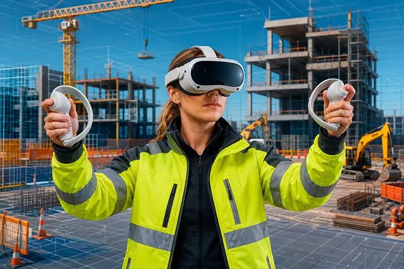
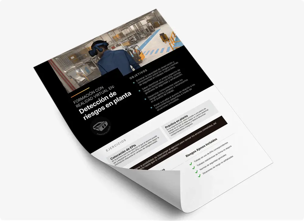
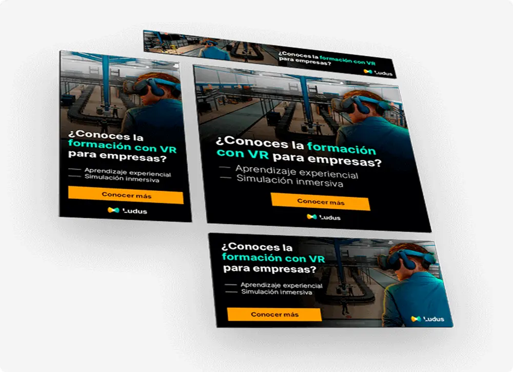
Ludus had developed a technology solution with significant potential: occupational risk prevention training using virtual reality.
The technology was striking, yes.
But that was precisely where one of the challenges appeared.
There was innovation, safety, training, realism, prevention, technology… too many layers trying to speak at the same time.
And a brand shouldn’t force the customer to become an archaeologist just to work out what we’re offering.
In this case, we worked on positioning, the value proposition, priority audiences, messaging, identity, narrative and the visual system.
The goal was to build a clearer brand, ready to grow.
A brand capable of explaining complex technology without becoming trapped inside the technology itself.
Because tools evolve.
Fast.
Very fast.
Today it’s virtual reality. Tomorrow it may be something else.
The value proposition should be able to survive both.
Neurtek: when design also means creating order

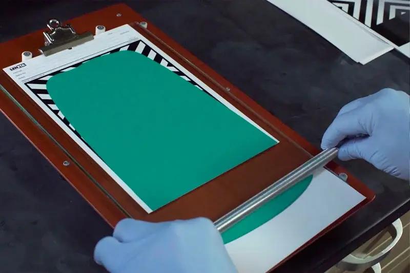
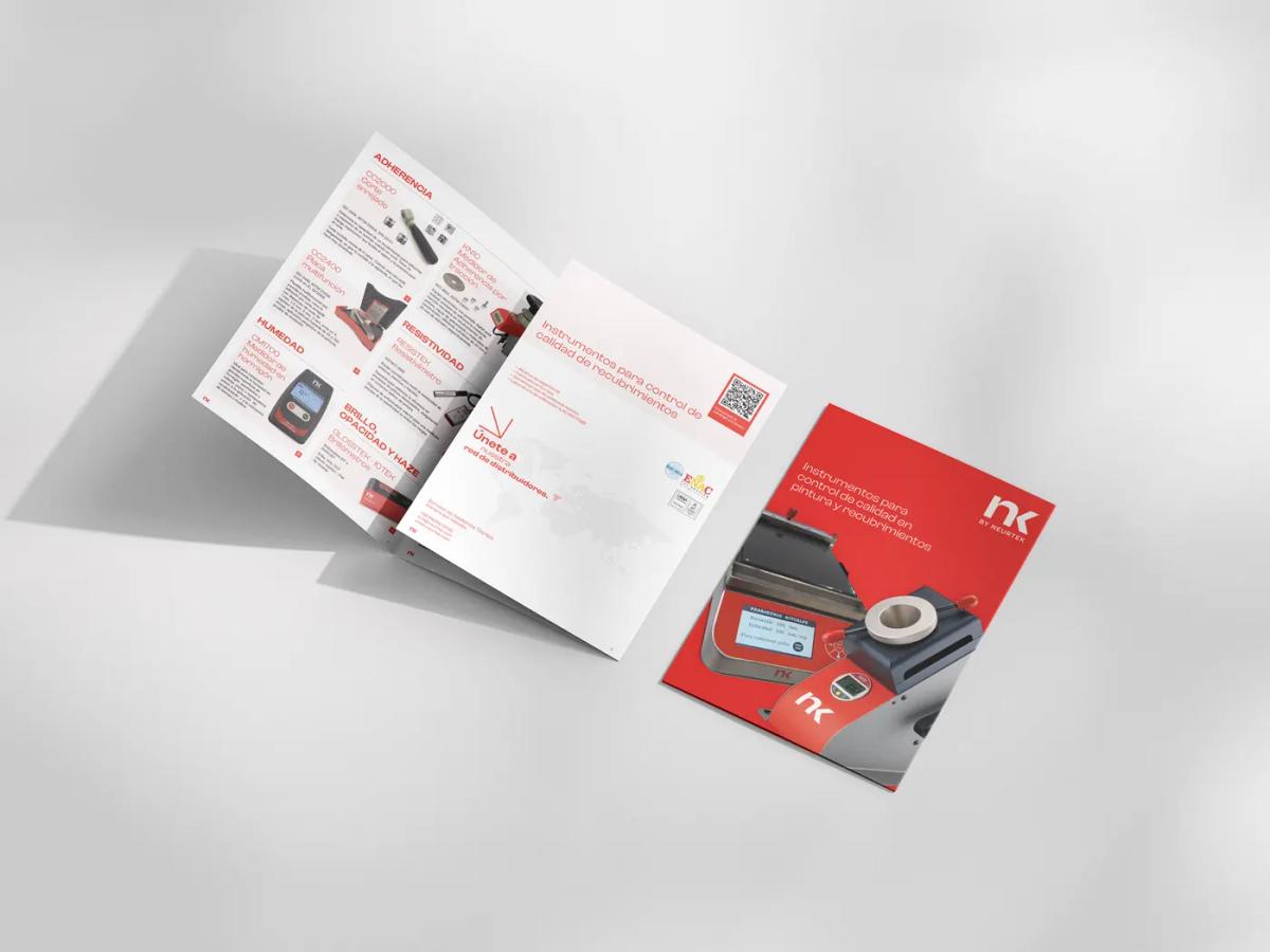
Neurtek manufactures and distributes quality-control instruments.
We’re talking about technical products, different product families, documentation, catalogues and international markets.
It doesn’t sound like the usual setting of the big branding books, where everything seems to revolve around trainers, soft drinks and brands that move millions of people emotionally.
And that’s precisely why we find it interesting.
Here, identity has another role.
To create order.
Order across product families.
Across catalogues.
Across messages.
Across a presence that needs to remain recognisable in different markets and formats.
Because as a company grows, every new catalogue, presentation, document or application can start developing its own rules.
And little by little, something dangerous appears: everything belongs to the same company, but it doesn’t always look like it does.
Working on identity in an environment like this means building a system strong enough for every piece to follow a common logic.
It may not be the most spectacular part of branding.
But in B2B, it matters enormously.
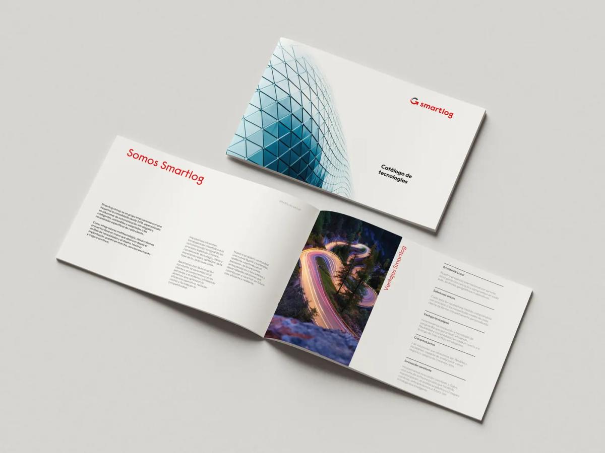
SmartLog Group: an identity designed for growth

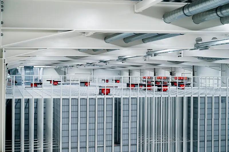
SmartLog Group is an engineering company specialising in intralogistics and going through a period of growth.
And growth creates some interesting identity challenges too.
New companies appear.
New divisions.
New services.
Possibly new markets.
And then a question arises that goes far beyond the logo:
How do we build a brand capable of integrating whatever comes next?
At SmartLog, the work is precisely about developing a brand system designed to incorporate new companies.
And this is where a particularly relevant concept appears: brand architecture.
Because designing an identity based only on a snapshot of the company today may work perfectly well now… and become a minor headache three years down the line.
We prefer to think about the whole film as well.
What can grow.
What needs to remain.
How the different brands will relate to one another.
What the market should recognise when new companies join the group.
Good brand architecture doesn’t try to predict the future.
But it does try not to close the door on it.
Gometegui: when the company has evolved faster than its image

There is a particularly interesting point in the life of some industrial companies.
The organisation changes.
It grows.
It invests.
It takes on more complex projects.
It enters new sectors.
But its identity continues telling an older story.
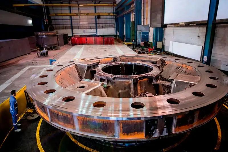
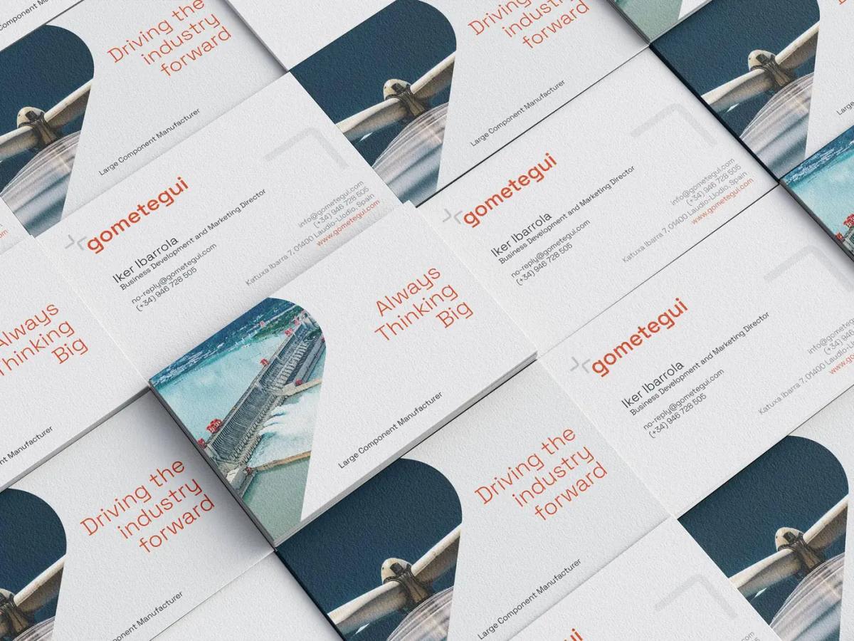
Gometegui is a good example of that situation: evolving from a boiler-making workshop into an industrial corporation equipped to compete in strategic sectors.
And at that point, the question isn’t:
“Does our logo look old?”
The question is far more relevant:
“Does our image still represent the company we have become?”
Because internally we may see an organisation with technical expertise, experience, technology and international projects… while externally people still perceive the company it was fifteen years ago.
In those cases, branding doesn’t invent a transformation.
It makes it visible.
The company may preserve its essence, its knowledge and much of its culture.
But its scale, capabilities and competitive landscape are now different.
And there comes a point when continuing to present ourselves as we did before is no longer a sign of continuity.
It simply means being left behind.
These four cases — Ludus, Neurtek, SmartLog and Gometegui — show exactly that: there isn’t just one reason to review a corporate identity.
Sometimes we need to explain things better.
Sometimes we need to create order.
Sometimes we need to prepare for growth.
And sometimes we simply need our image to catch up with the company we already are.
You can see these and other projects in our projects section.
Before designing: function, emotion and form
When we work on an identity, we usually start with three conversations.
Not with Illustrator.
Function: where will the brand live?
Before designing, we need to know where it will have to work.
On a website? On machinery? In technical documentation? In sales presentations? In catalogues for distributors? At international trade fairs? On packaging? In an application?
A purely digital company doesn’t have the same needs as a manufacturer with production plants, distributors in twenty countries and a regular presence at international trade fairs.
Context shapes design.
An identity that looks fantastic on a huge screen but disappears when engraved on a thirty-millimetre industrial component may not be as well resolved as it first seemed.
Emotion: what do we want to express?
This is where the familiar words tend to appear.
Innovative. Approachable. Professional. Reliable. Technological.
Almost everyone wants to communicate more or less the same things.
So we try to go one level deeper.
What does being innovative actually mean in our industry?
What behaviours make a company feel approachable?
Why should a customer see us as different from the twenty competitors using exactly the same adjectives?
That’s where the interesting work begins.
Form: how do we turn all of that into visual codes?
And then, yes.
The colours arrive. The typography. The shapes. The photography. The compositions. The iconography.
But we prefer form to be the consequence of the previous conversations.
Not the other way round.
The briefing: before we draw, we need to talk
An identity shouldn’t begin with someone opening Illustrator.
It should begin with a conversation.
About the business. About customers. About competitors. About markets. About company culture. About what we want to preserve and what we need to change.
The briefing allows us to organise all that information and turn it into a shared starting point between the company and the team working on the brand.
The process usually explores questions such as:
- company positioning;
- value proposition;
- priority audiences;
- personality and values;
- competitors;
- markets and countries;
- business objectives;
- expected uses of the identity;
- elements worth preserving;
- perception problems we need to solve.
And there’s one question we particularly like:
How do we want someone to describe our company when we’re not in the room?
There’s probably more branding in that answer than in twenty pages about corporate colours.
From the identity manual to the brand system
For years, people talked about the corporate identity manual almost as if it were a Bible.
A hundred pages.
Beautifully bound.
Covering every possible use of the logo.
And, in some cases, destined for a glorious future gathering dust on a shelf.
Today, we prefer to think in terms of a living brand system.
A set of rules clear enough to maintain consistency, but flexible enough to allow the brand to be used and to evolve.
It may include:
- brand concept and personality;
- logo construction and versions;
- minimum sizes and clear space;
- typefaces and hierarchy;
- colour system;
- photography and illustration;
- iconography;
- composition criteria;
- charts and data visualisation;
- presentations and documents;
- sales applications;
- website and digital environments;
- video and audiovisual content;
- examples of correct and incorrect usage.
What matters isn’t how many pages it has.
What matters is whether marketing, sales, distributors, agencies and suppliers can actually use it.
Without having to call the designer every Tuesday.
When does it make sense to change a corporate identity?
We don’t believe logos have an expiry date.
Nor do we believe a brand needs redesigning every five years because someone has discovered a new graphic trend.
There are identities that have worked extraordinarily well for decades.
The signal usually appears when a gap starts opening up between the company we are and the company we appear to be.
The reasons can be very different — a change of market, international expansion, new business lines, a merger or the need to organise several brands within a group — and they do not all call for the same response. We go through them one by one in the eleven signs that help decide when to rebrand.
And change doesn’t necessarily mean tearing everything down.
Sometimes the best redesign is quite subtle.
A new typeface. An adjustment in proportions. A simplified symbol. A broader colour system. A new photographic direction. A brand architecture that allows for growth. Or a much richer identity built around a logo that barely changes.
Like some good remastered albums.
At first, everything seems almost the same.
Until you listen to the old recording again.
In B2B, corporate identity also helps sell
This is probably the point that interests us most.
Working on an identity isn’t simply about making a company “look better”.
It helps a sales presentation feel as though it comes from the same company as the website.
It makes a technical catalogue easier to understand.
It helps a distributor in Germany and another in Mexico use a recognisable brand.
It makes our LinkedIn content easier to identify.
It helps explain complex products.
It brings order to the sales narrative.
It helps communicate a certain perception before the customer has even sat down with our sales team.
Ultimately, identity helps reduce the small amount of friction that appears when every touchpoint tells a different story.
And in B2B markets, where decisions are complex, several people are involved and sales cycles can be long, trust is built precisely through that accumulation of small interactions.
The logo matters.
Of course it does.
But the brand plays out in many more places.
If a company specifically needs to work on its corporate identity design, that’s where we explain in more detail how we approach these kinds of projects at Sakudarte.
This article has another purpose.
To show examples, raise questions and help us identify a signal that sometimes goes unnoticed:
Does our identity still accurately communicate who our company is today?
Because perhaps the problem isn’t that the logo has become outdated.
Perhaps the company is the one that has changed.
And the identity simply hasn’t realised it yet.
This article is part of our B2B branding.