
Industrial branding: how to turn your brand into something the company can actually use
An industrial brand does not end with a logo or a brand manual. The challenge is to translate positioning, messaging and identity into the tools used by marketing, sales and the rest of the organization.
Many industrial companies have worked on their brand. They have a defined logo, corporate colours, typefaces and, in many cases, a fairly comprehensive brand manual.
The problem appears when we look at how all of that is used day to day.
The sales presentation does not quite look like the website. The catalogue uses different messages. One subsidiary creates its own materials. LinkedIn communicates one way and a trade show another. And whenever someone needs to create a new piece, they start making decisions that, in theory, had already been made.
It is rarely a design problem. What usually happens is that the brand has been defined, but it has not yet been embedded throughout the organization.
And for us, that is where one of the most interesting parts of industrial branding begins.
Having an identity does not mean the brand is fully resolved
Brand, corporate identity, visual identity, logo and brand manual are related concepts, but they are not the same thing.
In our article on corporate identity, we look at those differences in more detail. Here, we are interested in something else: we can do strong strategic work and still struggle to translate it into the company’s real communication.
Positioning may be perfectly defined and still fail to appear in a sales presentation. We may have established a brand personality and then write every piece of content in a different tone. Or we may have an attractive visual identity that works beautifully in the applications designed by the agency, but starts creating problems as soon as the team needs to produce something new.
We have also seen the opposite: companies constantly producing catalogues, content, presentations, campaigns and technical datasheets without ever deciding what should connect all of them.
Defining the brand is one part. Making sure what has been defined is used consistently is another.
From a brand manual to a system people can actually use
A brand manual still makes sense. We need to know how to use the logo, which typefaces belong to the brand, what the colours are, which versions exist and which uses should be avoided.
But an industrial company usually needs to solve many more situations than that.
How do we create a technical datasheet? How do we present a new product family? What kind of photography do we use? How do we build a 40-slide presentation? What does the German subsidiary do when it needs a campaign that was never anticipated in the manual? And what about a distributor preparing materials for a trade show?
That is why we find it more useful to think in terms of a brand system: a set of criteria, resources and tools that allows a recognizable identity to be maintained across different situations.
That does not mean producing hundreds of templates. It means anticipating how the brand will actually be used.
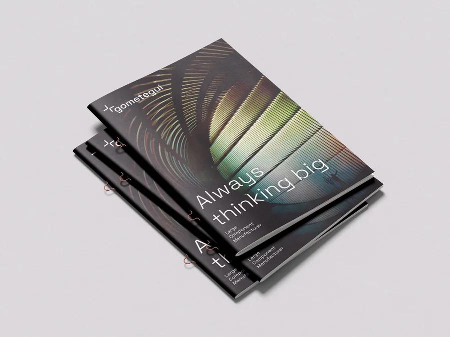
SmartLog is a good example. The work began by building its positioning, verbal and visual identity, website and content. As the company grew, new businesses, technologies and solutions were added, and that initial identity had to evolve into an architecture capable of integrating them without losing coherence. Today, that system extends across communication, software, machinery, graphic applications and the new brands joining the group.
The full case shows that evolution clearly: SmartLog: from an identity to a system built to grow.

First, decide what you want to represent
Before thinking about colours or applications, it is worth answering a rather more uncomfortable question: what do we want people to think about us?
Brand personality can be a useful tool for structuring that reflection. In 1997, Jennifer Aaker proposed five broad dimensions — sincerity, excitement, competence, sophistication and ruggedness — in her brand personality model. It is a framework that emerged from the study of consumer brands, not a specific recipe for industry, but it remains an interesting starting point.
The difficult part comes afterwards.
Saying that our company is «competent» means very little unless we explain what that actually means. It may mean meeting deadlines on complex projects, responding quickly to a production stoppage, mastering a highly specialized technology or manufacturing something other suppliers cannot provide.
The same applies to innovation, quality, experience, commitment or closeness. They may all be perfectly valid attributes, but they are used so often that they stop differentiating us unless we explain how they are expressed in our company.
Industrial branding needs to move quickly from adjectives to evidence.
Voice begins before tone
For years, brand manuals often dealt with voice through fairly simple guidelines: we use first names, we are approachable but professional, we avoid unnecessary jargon, we do or do not use humour…
That is useful, but there is a more important question to answer first: what do we actually need to say?
We need to know how we explain the company, which problems we solve, which arguments should remain consistent, what makes us different and what evidence supports what we claim. Only then does it make sense to decide on tone.
There is another challenge in industrial companies: we are not always talking to people who value the same things. Senior management may want to understand the business impact of a solution, while engineering needs much more technical detail and procurement focuses on other factors.
We should not become a different company for every audience, but neither should we repeat exactly the same message to everyone.
A good messaging architecture allows us to do both: adapt the conversation without losing the common thread.
The visual identity has to survive real life
A logo can be beautifully designed and solve very little once day-to-day work begins.
Visual identity includes typefaces, colours, photography, iconography, graphics, layout, video, interfaces and many other resources depending on the type of company. What matters is that the overall system has enough range.
Two corporate colours may work perfectly on a business card and fall short when we need to represent five product lines. A certain style of photography may look impeccable and still communicate nothing about production capacity, people or technology. A corporate presentation may need resources that were never considered in the identity’s initial applications.
That is why it is worth designing with future use in mind.
Consistency does not mean everything has to look identical. It means we can still recognize the same company even when the format, market or content changes.
What changes in industrial branding compared with consumer branding?
We do not think there is an absolute dividing line. Many tools are shared and, ultimately, there are people making decisions behind every company.
But the industrial context introduces some particularities.
The product usually requires more explanation. A decision may involve technical, commercial, financial and operational profiles. Sales cycles can be long, and much of the trust is built through evidence: experience, facilities, projects, certifications, technical knowledge, service or the ability to reduce risk.
The touchpoints are different too.
In consumer markets, we quickly think of packaging, advertising, retail or social media. In industry, a technical datasheet, a proposal, a sales presentation, a factory visit or a trade show stand can have enormous influence on how a company is perceived.
This means industrial branding has to work especially closely with product, sales and technical knowledge. That is also the logic behind our B2B branding service: not to build an isolated identity, but to make sure positioning, messaging and design reach the tools the company actually uses.
It is not enough to look different. We also need to help people understand why we are different.
Storytelling, yes. But without turning the company into something it is not
There is another widely repeated idea that we would qualify.
We often hear that customers do not buy what you do, but why you do it. As a way of thinking about purpose, that can be useful. As an explanation of how an industrial company buys, it falls rather short.
A customer may choose a supplier because its equipment has specific capabilities, because it holds a particular certification, because it can deliver sooner, because it can manufacture a complex part or because the customer knows it will respond when a problem arises.
The product matters. A lot.
That does not make storytelling irrelevant. It simply changes its role.
A company does not need to invent an extraordinary story. It needs to explain clearly where it comes from, what it has learned, what it does particularly well, how it works and why any of that should matter to the customer.
A family-owned company with fifty years of history may have a great deal to tell. So can a technology company founded five years ago.
The story works when it helps people understand the company, not when it tries to turn it into something it is not.
Branding has to reach the sales team
This is probably one of the clearest places to see whether the brand work has actually worked.
What does a salesperson use to introduce us?
What does a proposal look like?
Do the sales arguments match what appears on the website?
Do we have case studies ready to demonstrate particular capabilities?
Are teams in different countries explaining the same company?
At Renold Chain Europe, that was precisely the challenge. France, Germany, Iberia, the UK and the Nordic countries operated with considerable autonomy and created materials that did not always follow the same logic. Catalogues, brochures, content and other assets could end up using different styles.
The job was not to change Renold’s global identity, which was already defined, but to help it work more consistently across different markets: new catalogues, sales materials, landing pages, content, campaigns and trade show presence. The result is more coherent communication without removing each country’s ability to respond to its own needs.
You can see the Renold case study here.
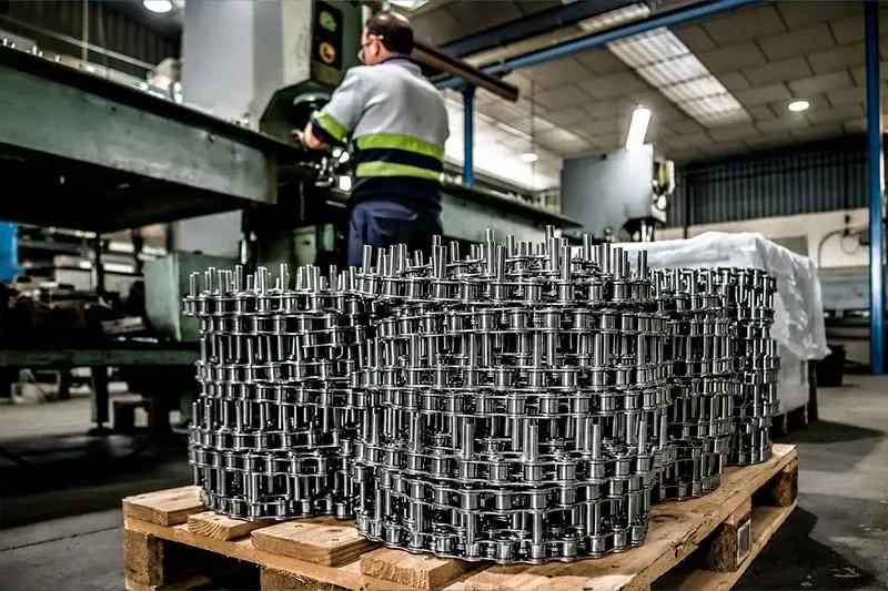
We find this example particularly interesting because it shows that bringing a brand to life does not always mean redesigning it. Sometimes the problem is simply making an existing identity work better.
When brand architecture has to follow the business
There are situations where the challenge is not to apply an identity better, but to decide what role each brand should play.
That is what happened with NEURTEK.
The company had spent decades being recognized as a distributor of quality control instruments, but it also manufactured its own products and wanted to grow that side of the business internationally. To expand through other distributors — some of them competitors of NEURTEK in certain markets — manufacturing and distribution needed to be separated.
That led to NK by NEURTEK.
NK needed enough independence to present itself as a manufacturing brand, but giving up almost fifty years of accumulated recognition overnight did not make much sense either. The by NEURTEK endorsement allowed that credibility to be retained initially while an independent identity was built, together with its own website, catalogue, product sheets and sales materials.
The NK by NEURTEK project shows clearly why brand architecture is not purely a graphic issue. Sometimes it responds directly to the way the business wants to grow.
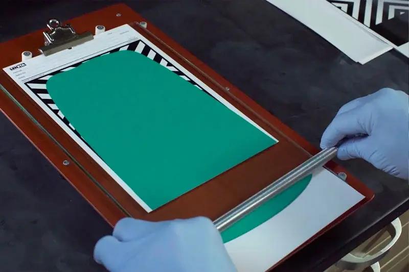
We also need to think about who will use the brand afterwards
Once the project is finished, we will not be there every time someone needs to create a presentation, prepare a datasheet or publish a piece of content.
The brand will be used by sales, product teams, HR, subsidiaries, distributors, external suppliers and people who may not even work at the company yet.
That is why templates, asset libraries, examples and easy-to-consult guidelines matter. Not to fill folders with documents nobody opens, but to reduce the number of decisions each person has to improvise.
The level of development will depend on the company. A small Spanish industrial business and an international group with subsidiaries in several countries do not need the same system.
The question is simpler: can someone use the brand correctly without having to ask the person who designed it every single time?
If the answer is no, there is probably still work to do.
The real test of industrial branding is how it is used
We can review a brand manual page by page, but it is usually much more revealing to look at what happens on an ordinary Tuesday.
Open a sales proposal. Visit the website. Review a product sheet. See what a subsidiary is publishing. Ask someone where they find the photographs or which presentation they use when a new customer appears.
That is where we quickly discover whether there is a common logic or whether every piece has evolved independently.
That is why we believe industrial branding does not end when the logo is approved or the brand manual is delivered. Nor does it end when we present a polished PDF explaining the positioning.
It starts proving its value when it reaches the things the company actually uses to explain what it does, sell, grow and build relationships with customers.
Sometimes that means evolving the identity. In other cases, it means reviewing the whole architecture; we discuss when that makes sense in our article on when to rebrand.
But before changing anything, it may be worth asking a more basic question:
Is the brand we already have really present in the company our customers see every day?
This article is part of our B2B branding.